I wanted to share with you all my recent experience dealing with design briefs and taking into account specific advice from some of the fantastic designers I’m currently working with.
The goal of this blog post is to help you make your design process more streamline and if your a client, to help you keep the project moving in the direction it should be, helping you to instruct the designer more clearly. This post is a continuation from my recent post on ‘How to get the Best from your Website Designer.’
With any design work, wether it be designing a business card, website design or presentation a clear brief is always required to ensure the designer can work freely to create the best work possible.
Establishing the First Creative Concepts
 Getting as much input from the client at the initial concept stage is important, this is your opportunity to narrow down your ideas to a clear selective choice of concepts to explore further.
Try not to overwhelm the designer with too many ideas, if you want a modern looking design don’t suggest both modern and old fashion. If you have particular font type your keen on, give the designers some options but make sure you indicate your preferred choice clearly.
Normally, when the finished concepts are provided to you there will be a couple of variations for you to choose from. This might be variations on colour schemes, logo type, fonts or different proposed website layouts.
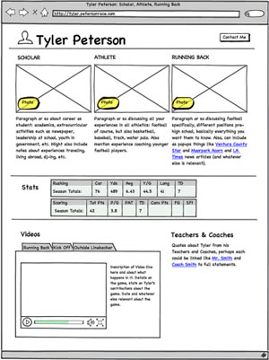
*Note for website or logo design, it can be appropriate to work with wireframes at this stage to get the structure and look of the design correct without having to worry about the aesthetics.
For the first creative concepts the designer shouldn’t supply more than a couple of variations as to not overwhelm the client with too much choice. 2-4 variations is plenty depending on the project, for website design 1-2.
As the client, you should inform the designer which variation of the concept you prefer the most. You should be clear that this is the variation you want to take forward into the next design stage.
Complete the Design Mockups
Now that you have your initial logo, business card or website design defined it is time to explore this concept further to take the design through to the finished completed article.
Here are some crucial points to remember:
- If there is any particular area of the concept design you don’t like then make the designer clear. This should be done before they expand on further suggestions to complete the finished design.
- This stage is NOT the appropriate point to be suggesting new ideas, layouts or concepts.
- If you’ve got the wireframe agreed for the layout, here is the opportunity to change the colour scheme and ascetics before the design is finalised.
- Don’t leave changes to the colour scheme or look and feel when the design is complete. This is especially relevant in website design when making any design changes to a fully code website can slow and impact on the cost of development dramatically.
Suggest Amends not Ideas

Try not to get confused between an amend an idea. An amend is a change e.g. can we change the colour to blue?
An idea suggests more than a change but new elements to a concept e.g. Could we try variations on the font type? or I’m not sure about the structure of the logo, perhaps we could see what it would look like if we change the elements around.
An amend could be the colour, look and feel or position of a design. It also can be a correction to grammar or text. Dictornary.com defines an amend as to; alter, modify, rephrase, or add to or subtract from
An idea is completely different, it is a thought, conception, or notion. It can also be an opinion, view, or belief. Opinions are dangerous in design, especially if they are not backed by clear explanation and reasoning.
I’ll leave you with this great quote from Bruce Lee, that is very applicable to martial arts but I feel it is easily appropiate for the design process.
If you spend too much time thinking about a thing, you’ll never get it done. – Bruce Lee

