Firstly, I want to tell you a story on how I actually got writing about this post. It all started when I asked by a client to do some potential research into wine websites, the client in question was looking to launch his own wine selling company and needed advice on the design.
I started bookmarking every great example of wine websites I came across, this is now my third post in the series and I’ve covered 22 different wine website examples.
If your interested here is my original post 5 Examples of Beautiful Wine Websites and the follow up entitled 7 More Amazing Wine Websites. Let’s take a look at all these lovely wine website examples, sit back, relax, grab a glass of wine and enjoy.
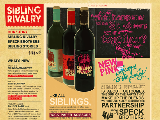
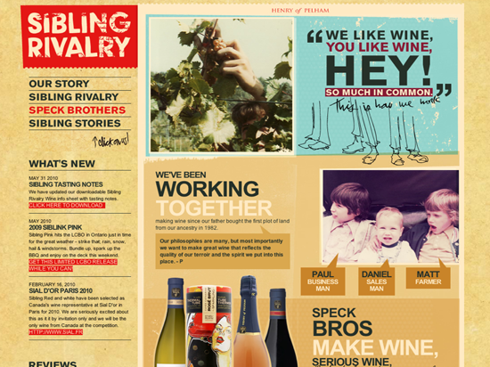
Sibling Rivalry Wine – The Speck Brothers
A truly awe-inspiring website. I really like the design, it is the best wine website I have seen so far and definitely my favourite example. Great use of typography here to really bring out the overall impact of the design.
Fledgling Wine
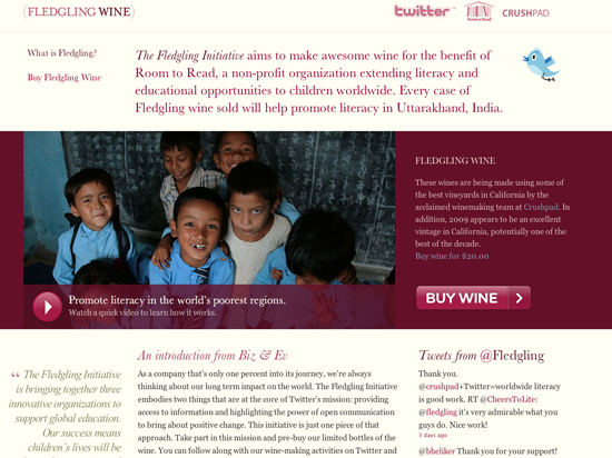
Fledgling Wine, is a brilliant concept. The Fledgling Initiative aims to make awesome wine for the benefit of Room to Read, a non-profit organization extending literacy and educational opportunities to children worldwide. Every case of Fledgling wine sold will help promote literacy in Uttarakhand, India.
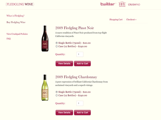
It is such a nice thought that any lovely wine you buy, goes to a very good cause. The website isn’t half bad either, the design is very well put together and laid out well, good use of call to actions throughout the site.
Wines of Substance
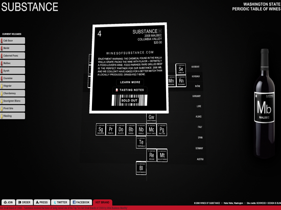
This website is an interactive periodic table of wines, it takes a while to load but it is worth the wait to see the cool interactive movable periodic table of wines.
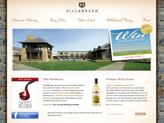
One of only a few winery websites to be promoting their Facebook fan page on their homepage.
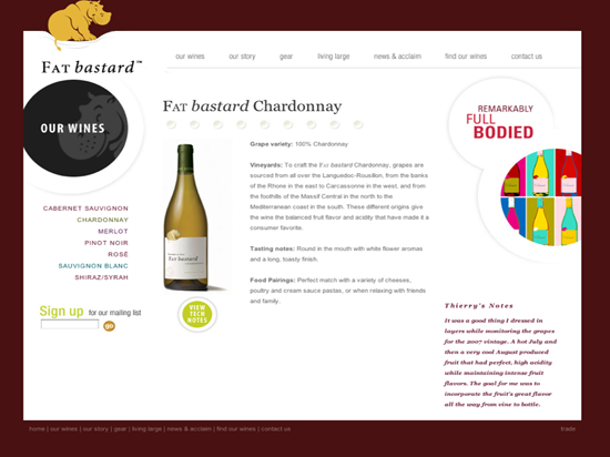
The humorously entitled ‘Fat Bastard Wine‘ have a very nice website that showcases their wine beautifully. I particularly liked the good use of images and layout to bring out typography and key design elements. This is a great site, with a very unique brand. Your not going to forget the name in a hurry, that’s for sure!
