We’re back and with some more juicy, beautiful & gorgeous looking wine websites. Illiya you ask, what is your obsession with wine websites, well as I explained in my earlier post 10 MORE Examples of Beautiful Wine Websites, a client of mine once asked me to research and supply some examples of wine websites for a winery website they were thinking of building. Since that day, it has become something I really enjoy writing about and now have an authority on, plus everyone enjoys a nice glass of wine from time to time and I like the bottle designs. Ok lets get to it…
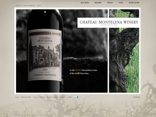
Good use of Flash here, it doesn’t take an age to load and actually adds to the impact of the website, there is nice rollover effect when you hover your mouse cursor over the second image more text displays. This same effect could of been achieved using jquery as well. I like the big wine image shot that is displayed in the flash movie, it really gives impact to the website. Most of the best wine websites you’ll see use powerful high resolution imagery of their wine bottles. It is crucial to get the brand name and wine bottle label in the photography shot.
Good use of links to social media profiles, that is always a plus, so many companies don’t or forget to promote their social media profiles on their website.
Cudos to Chateau Montelena Winery, they also have a Mobile version of their website. This is the FIRST I’ve seen out of hundreds of winery and wine websites I’ve looked at. Well done!
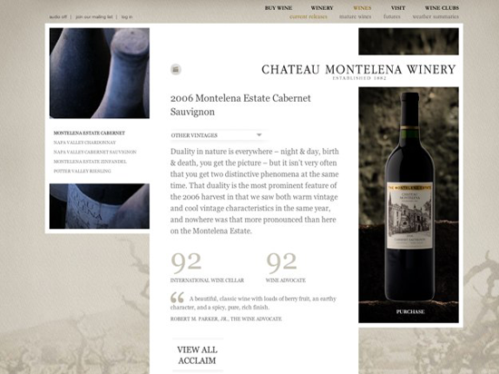
Inner pages are nicely laid out, good use of typography here to display the reviews from various wine tasting authorities, again great use of imagery on this page to display the quality of the wine, doesn’t it just look elegant and beautiful. I wonder if Gary Vaynerchuk has reviewed this one? For those of you who aren’t familar with Gary Vaynerchuk, he is a New York Times bestselling author and American businessman who in Feb 2006 launched Wine Library TV, a daily video blog about wine. With the tag line “changing the wine world,” the show offered an unpretentious approach to an historically stuffy subject. Gary is very well respected in the world of social media and wine because of the huge success of Wine Library TV.
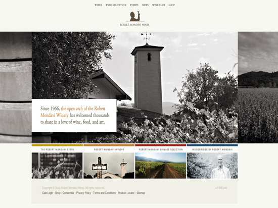
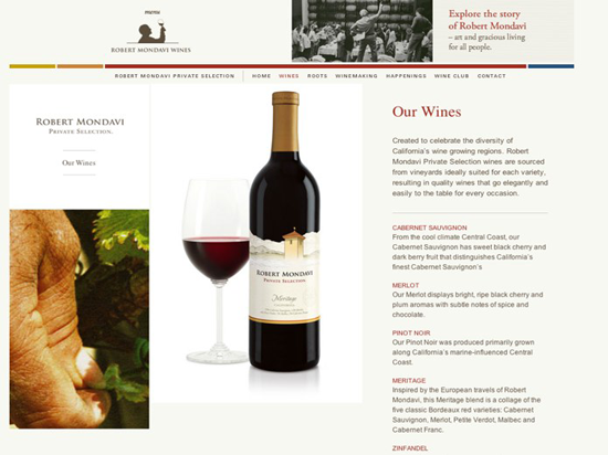
You maybe thinking to yourself this website looks quite familar to Chateau Montelena Winery, although they don’t share the same layout you can tell they were done by the same website design company. Robert Gerald Mondavi, was a leading California vineyard operator whose technical improvements and marketing strategies brought worldwide recognition for the wines of the Napa Valley in California, find out more about Robert Mondavi.
Again this website uses flash well and very sparingly to add impact to the main homepage. Overall the website has nice clean lines and layout which is visually appealing throughout.
On the inner content pages the text is nicely aligned next to the beautiful wine bottle photo, even better this time they have include a photo of the wine contained in a glass to add further impact to the image. Are you noticing the trend here?
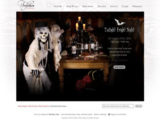
Gearing up for Halloween, Threfethen Wines have a nice horror inspired shot to promote a wine tasting event they are running in October to promote their wines. It is a good idea and from the look at their Facebook fan page with over 2,000 fans they have a very engaged audience which they can certainly maximise the power of social media to raise the profile of the event.
The homepage image changes periodically to swap to a new image, this is a feature seen on a number of wine websites I have reviewed but… hooray it is done using jquery and not flash! (Note I don’t hate flash I just think it is over used in website design especially when jquery can do the same job and its usually takes less time to develop)
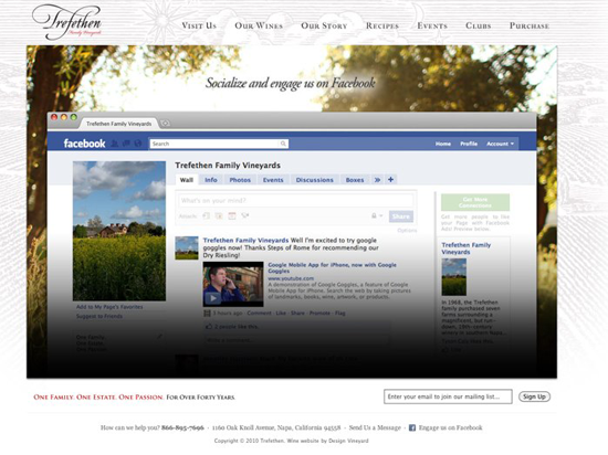
How is that for promoting your Facebook fan page, I must say that is again a FIRST! I like the idea though, well done Threfethen you are truly embracing social media. They also promote their Facebook fan page by a ‘Engage with us on Facebook’ call to action, you know a marketeer wrote that with the words ‘engage’, still it is well placed and good to see.
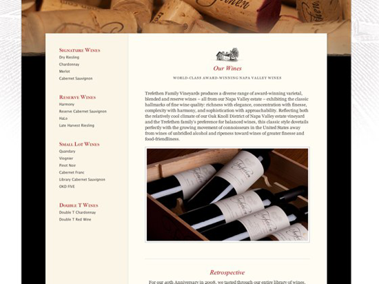
Inner pages are well laid out and the typography complements the page design. The product images have been shot slightly differently this time, notice the quality of the image though.
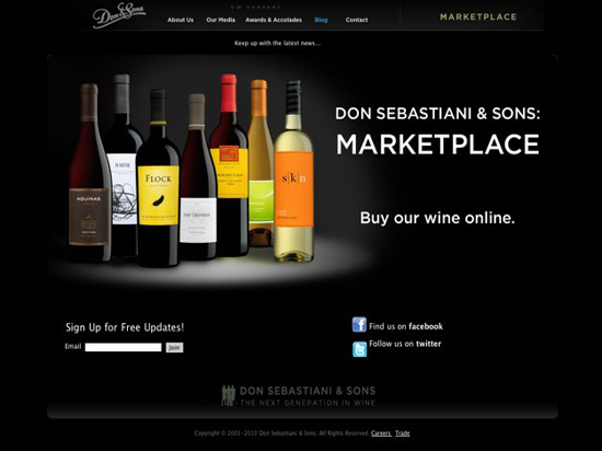
Images of the wine collection looks fantastic, I like how it has been designed to emulate a spotlight shiny down on the wines. Facebook & Twitter profiles both promoted on homepage. Black websites can sometimes be overpowering but this ones looks good, mainly because the image helps breaks up the black. Its back to flash with the roll over images for the homepage hero shot.
You can buy wines from this website an the e-commerce functionality is done well, finding it from the menu is a little less clear. If you click on marketplace in the navigation bar it will take you to the shop. It is isn’t too clear to the average user that this is even a link as it’s large than the rest of the main navigation menu. There is also a rollover when you hover over marketplace link and this confuses the navigation further.
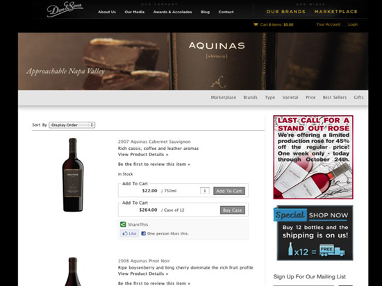
Once you get to the marketplace, things look really good. Excellent product shots and descriptions and very good implementation of the Facebook like button, this means users can like a wine on the website and have it posted to their Facebook profile for all their friends to see. For certain wines they have also pulled in the reviews from leading wine reviewers which is a nice feature.
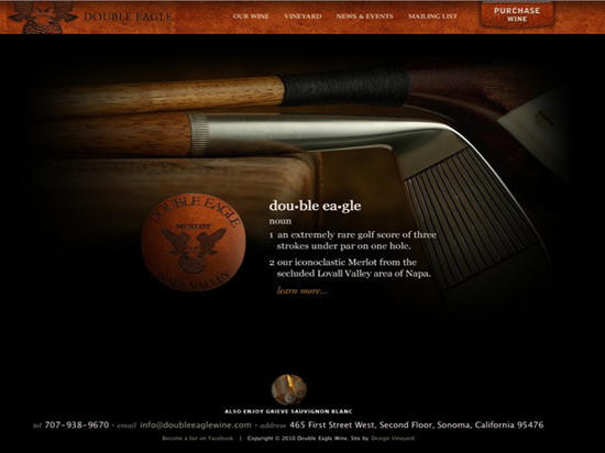
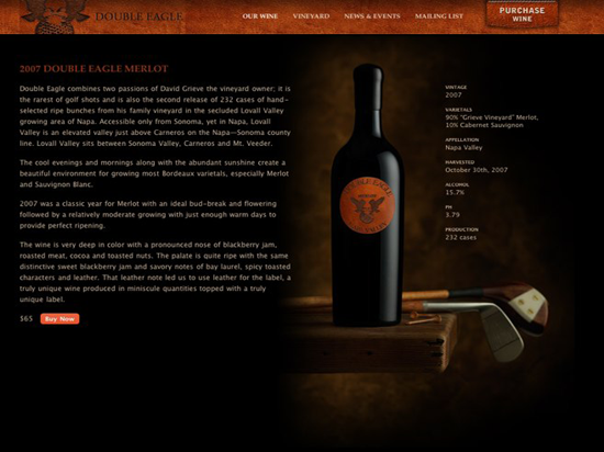
Dark colour scheme suits the style of wine bottle, there is good use of imagery again here to bring out the features of the brand and wine bottle across the website. Their social media profiles could be promoted more visibly on the homepage.
Like Wine Websites?
Of course you do, I would encourage you to subscribe to this blog below if you enjoyed this post or any of the previous wine website posts. Also make sure you check out our previously wine website design inspiration blog posts listed below.If you got an examples I haven’t listed feel free to share them in the comments.
