This a round up of my previous wine website example posts for your inspiration. I’ve also added a number of new finds into this post for 2013.
I’m carrying on this series on the back of requests from a handful on my readers who asked me for some more recent examples.
If you are looking for a company to design or build you a stunning wine website I can honestly recommend you get in touch with me directly. Having been involved with web design way before it was even considered cool and being a wine website buff I’m actually the guy you need to speak to!
Previous Wine Website Examples:
Here are some of the previous wine website posts I’ve done.
- Wine Website Design Inspiration #4
- 10 MORE Examples of Beautiful Wine Websites
- 7 More Amazing Wine Website Examples
- 5 Examples of Beautiful Wine Websites
Latest Wine Website Design Finds:
I’ve enjoyed a few decent bottles of wine over the last few months with some good friends, one friend in particular my buddy Nick Walker knows far more about the actual drinking of wine than I do. You should get in touch with him if you want to buy some nice wines!
Eastern European wines are the best (if I don’t say so myself), obviously I’m incredibly biased here. I’m actually a big fan of Spanish wines myself as I find them to my taste.
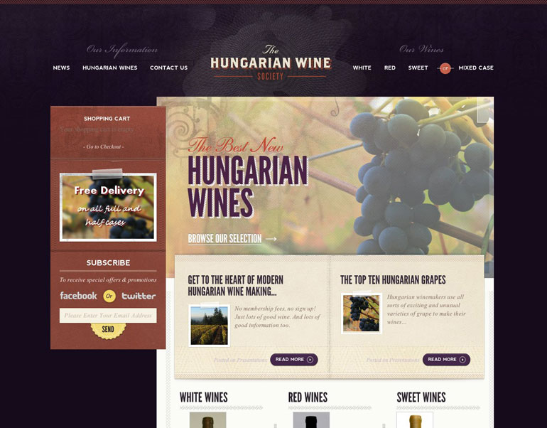
Maybe you’ve never tried Hungarian wine’s before but now is your chance. What I really love about this website is the colour scheme and the typography primarily. Also, there is some really well thought content on this website.
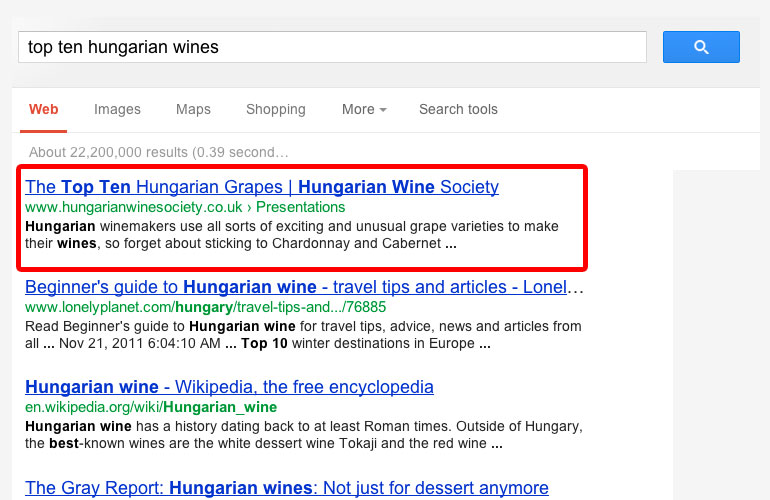
I did a bit of digging by searching for ‘top ten hungarian wines’ in Google and look what I found.
Yep, they certainly understand their SEO and are outranking both the Lonely Planet and Wikipedia no doubt. Folks this is what content marketing and good SEO looks like. Please take note.
A nice looking website is just the start of building a business online, most people build it and then hope people will just show up. If you try this in 2013 you are going to be in for a nasty shock!
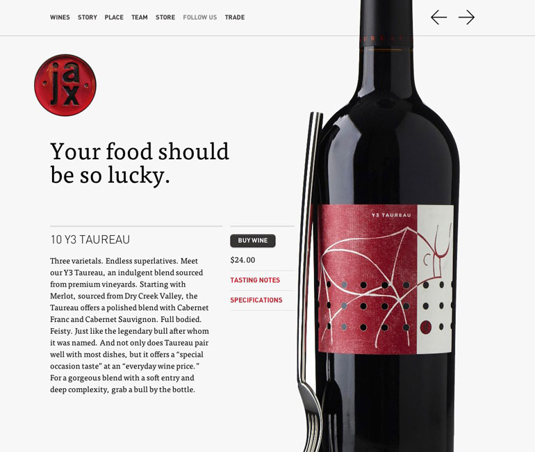
In complete contrast to the previous example Jax Vineyards have opted for a very clean and minimalist look to their website which helps create an overall modern feel.
The powerful striking image of the wine bottle and fork really capture your attention and complement the creative copy well. This a common theme that is seen in the better wine website examples. I’ve being saying it for years, good imagery really makes a website go from good to great.
If you can’t take good images you should look to employ a creative photographer who can.
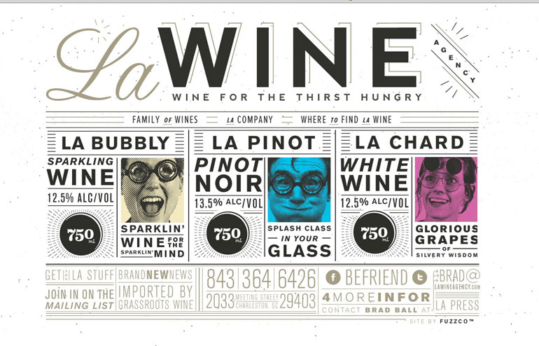
The LA Wine Agency website is extremely type led which gives it a unique design that sets it apart from its other competitors. I love the creative images used for each of the wine types.
The only problem I have with this website is the navigation and usability is made far more difficult because of the typographic design. For people who aren’t great web users and want to buy some wine from this website quickly they might struggle to find where they are going.
My props though to LA Wine Agency for doing something completely different.
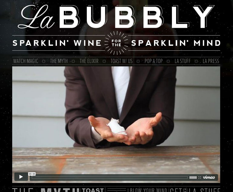
Everyone loves a nice glass of bubbly, especially when it’s well deserved. What I really like about this example is the focus on the video as the primarily thing a web user would interact with.
It’s been well documented that video can help improve user engagement with a page of content and even increase conversions. Not only is this video interesting and unique, it also draws your interest into the website well.
Again, great use of typography to give this website a style, personality and overall impact. I think it’s a fantastic example of how to do it right.
Well, that’s it for now folks. Stay tuned for more updates from the Cork & Bottle series.
Flickr image credit for blog header – Image of Wines by Alex Brown, alexbrn edited by Smartdog digital
